the art and design journal

..:: IAMRAV ::..

Showing posts with label Typography. Show all posts

FAIZAL LULAT

Monday, 3 May 2010 by ..:: IAMRAV ::..

I DONT WANT TO SAY MUCH ABOUT THIS DUDE AS HIS WORK DOES MOST OF THE TALKING, I CAME ACROSS HIS STALL OF PRINTS AT BRICK LANE MARKET AND DELVED INTO HIS PORTFOLIO OF FINE ART / PHOTOGRAPHY / TYPOGRAPHY... ENJOY


"Encouraged to be creative at a young age, I excelled at the Arts at Secondary School and went on to study Fine Art, Graphic Design and 3-D Design at A-Levels. A Foundation course followed at Chelsea College of Art. Where the freedoms of the studio space allowed me to leave with a Distinction.

A Gap Year was in order and I headed off to Peru and Bolivia for a while, where the experiences had, would have lasting impressions upon my being.

University followed and due to influences I went on to study Graphic Design. For three years I had to constantly question the creative process. Coming from a predominantly Fine Art mind set to think, as a Graphic Designer was a challenge. The result of this constant battle was a deeper conscious understanding of what I was producing as a creative.

University ended and my confidence as a creative was in tatters. I spent the next year working a low paid job and eventually decided to go backpacking. Traveling overland I journeyed through France, Spain, Morocco, Western Sahara and ending up in Mauritania. Living in the Sahara Desert with village people and nomads. Unfortunately I had the means to come back to London and a change of heart later I was back in the rain going to a job I didn’t like.

Fortunately they had to fire me and with work scarce and an increasing attachment to God I went on a spiritual exercise. Upon returning and in search of a direction In Life, inspiration led me to start selling some of my work at a small stall in Brick Lane. With the stall providing an outlet for the artistic soul, dreams and aspirations are again filling the horizon.

The creative process is full time, constantly aware of lines, forms and colour. Searching for the beauty in everyday and the meaning behind instances. Inspiration is Life and such is its character that the imagination is bombarded with an overload of stimulus, on an almost constant turn of the head."

LETTERPRESS + RULES OF TYPOGRAPHY = AVEC OU SANS?

Saturday, 13 June 2009 by ..:: IAMRAV ::..


THIS BRIEF THAT I DID WAS TO TAKE A PARAGRAPH ABOUT TYPOGRAPHY AND CREATE A DOUBLE PAGE SPREAD USING...TYPOGRAPHY! MY PARAGRAPH WAS ABOUT HOW SANS TYPEFACES ARE DIFFERENT TO SANS SERIF...ENJOY

Filed under , having 0 comments  

JOHN PRAG + TOKYO = DESIGN MOGUL

Saturday, 23 May 2009 by ..:: IAMRAV ::..


''Johan Prag is a Swedish Art Director living and working
in Tokyo, Japan. Before coming to Tokyo, he was part of renowned design agency Stockholm Design Lab where
he among other things worked on the rebranding of
Scandinavian Airlines System as well as on several award
winning television identities.''

AS QUOTED FROM HIS WEB PORTFOLIO - BRANDING, PACKAGING, GRAPHIC DESIGN, DIRECTION, PHOTOGRAPHY, COMPUTER GRAPHICS, MOTION GRAPHICS PRODUCT DESIGN....THE GUY KNOWS KNOW LIMITS


RUBIK'S CUBE x LETTER PRESS TYPE = HYPPPPPPPE!!!

by ..:: IAMRAV ::..


I WANT ONE NOWWWWWW!!!!!!!!!!!!!!!!!!!!!!!!!!!!!!!!!!!!!!!!!!!!!!!!!!!!!!!!!!!!!!!!!

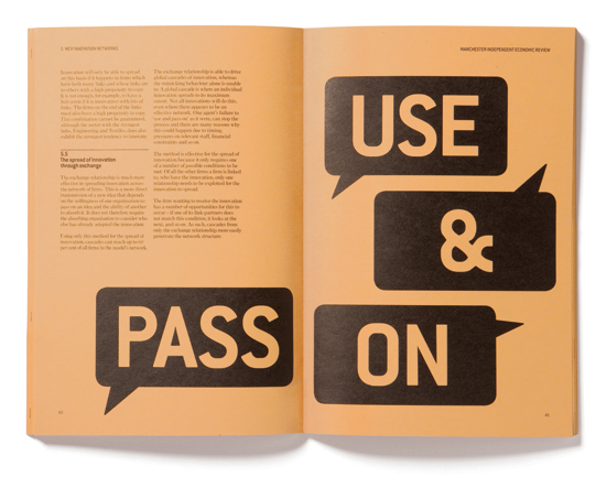
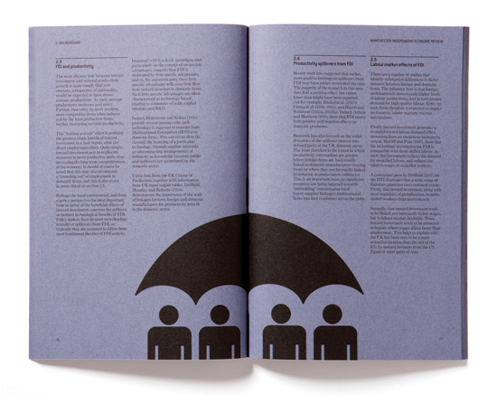
FACTS + DESIGN INNOVATION = MANCHESTER INDEPENDENT ECONOMIC REVIEW

Sunday, 17 May 2009 by ..:: IAMRAV ::..


(CREAVITY + SKETCHBOOK) x FONTMAKER = PROTESTER FONT

Thursday, 14 May 2009 by ..:: IAMRAV ::..


BEEN SOME TIME SINCE I UPLOADED SOME OF MY OWN WORK BUT BEEN BUSIER THAN BUGS BUNNY IN CARROT SEASON. IV'E BEEN WORKING ON A TYPEFACE FOR MY FINAL MAJOR PROJECT FOR THE END OF MY BA HONS COURSE BASED AROUND STENCILS USED FOR PLACARDS AND PICKETS FOR PROTESTS. WATCH THIS SPACE FOR MORE FMP UPLOADS. LET ME KNOW WHAT YOU THINK!!!

TYPOGRAPHY!...FROM GOOGLE MAPS?

Monday, 27 April 2009 by ..:: IAMRAV ::..

TYPOGRAPHY ALERT!!!

Friday, 10 April 2009 by ..:: IAMRAV ::..

ALERT ALL TYPOGRAPHICAL CREATIVES OR ALL THOSE WHO NEED TO IMPROVE THEIR TYPOGRAPHY HERE ARE 8 SIMPLE RULES TO IMPROVE YOUR TYPOGRAPHY...CLICK HERE FOR THIS MUST READ!!!

Filed under having 0 comments  

ALERT!...ALL TYPOGRAPHERS/TYPOGRAPHISTS!

Thursday, 19 February 2009 by ..:: IAMRAV ::..

IF YOU HAVEN'T HEARD OR SEEN WORK OF CRAIG WARD THEN YOU WILL NOW...DO NOT FORGET TO CLICK ON HIS NAME FOR THE LINK TO HIS WEBSITE - BLOOD PROMISE YOU WONT BE DISSAPOINTED...HERE'S SOME OF HIS WORK.


(READ IT UPSIDE DOWN...GENIUS!)


Filed under , having 0 comments  

CIRCULAR TYPOGRAPHY BRIEF

Friday, 13 February 2009 by ..:: IAMRAV ::..

BEFORE XMAS I WAS DOING AN INTRODUCTORY BRIEF ON MY BA COURSE, WE HAD TO MAKE A CHOICE FROM YCN, D&AD OR RSA BRIEFS FROM THE PREVIOUS YEAR. I CHOSE TO DO A TYPOGRAPHY BRIEF SINCE I JUST LOVE ANYTHING TYPOGRAPHICAL!!! I HAD TO COMMEMORATE CIRCULARS 25 YEARS IN TYPOGRAPHY WITH A PARTICULAR THEME THAT INVOKED INSPIRATION AND EDUCATION. I CHOSE TO USE MUSIC AND THUS CREATED A BOOKLET WHICH TALKED ABOUT THE RELATIONSHIP BETWEEN MUSIC AND LANGUAGE, AND HOW THE BRAIN SEE'S THE TWO AS SIMILAR SYNTAX'S, WITH A AVANT-GARDE RUSSIAN FUTURISM STYLE. I'M CREATING THE FINAL FINISHED PRODUCT OF THE BOOKLET BUT JUST WAITING FOR THE GFSMITH PAPER SAMPLES - SEE WHAT YOU THINK OF THE FINAL DESIGNS BELOW (THE FIRST TWO IMAGES ARE THE OUTER AND INNER COVER RESPECTIVELY, AND THE NEXT THREE IMAGES ARE THE POSTCARDS WHICH CAN BE INSERTED INSIDE THE BOOKLET FLAP [THE TREBLE CLEF PAGE]).